Visualising your Work Network #2

Over 2 years ago I had a go at visualising my work network using LinkedIn Labs InMap. You can see the resulting map and the blog post. I was hoping to see how my network had progressed since I left my previous place of employment (more people – a different set of groups etc.) but LinkedIn retired InMap last year – which makes things a bit tricky. However there are some other visualisation tools around that work well with LinkedIn.

Socilab is one such tool. This Socilab project is open source, and intended for personal or academic use. The idea is to educate people about their social network data and to make analysis more accessible for everday users. It has been used at over 20 universities across the world to teach students about the power of social network analysis as part of undergraduate and MBA curricula. Socilab works using the LinkedIn API – unfortunately due to LinkedIn API limitations it can only use 499 of your contacts in one go. The API limit is reset at 12am every day so I’m planning to go back there tomorrow!

Socilab

Socilab does give you some stats about your network which you might find useful though…

Screen Shot 2015-08-18 at 16.44.41
Screen Shot 2015-08-18 at 16.44.55

Possibly the coolest thing is that you can export your data [in ‘CSV adjacency matrix or ‘Pajek .net edge list’] and use it elsewhere.

Linkurious gives some things you can so with the data if you have the skills. Gephi is probably the best tool to use.

gephi

After quite a bit of experimentation I’m still hunting for a tool that does the job as easily as Inmap – any suggestions?

Data Viz of Guest blog posts

I am having a play around with Tableau Public for some work I am doing on the PASTEUR4OA Project. Tableau Public is free software that can allow anyone to connect to a spreadsheet or file and create interactive data visualizations for the web. It took me a while to get started (my operating systems on all my windows machines and macs weren’t up to date enough!) but now that I’m in I’m really getting the hang of it.

I can’t embed the javascript code here but you can go to my Tableau Public profile to see the interactive versions.

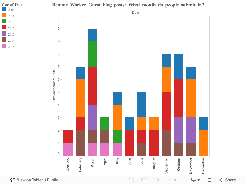
I started off with looking at how many guest posts had been submitted and in what month they tend to come in. You can see from the visualisation that March is a really popular month, followed by September and August.

Remote Worker Guest blog posts: What month do people submit in?

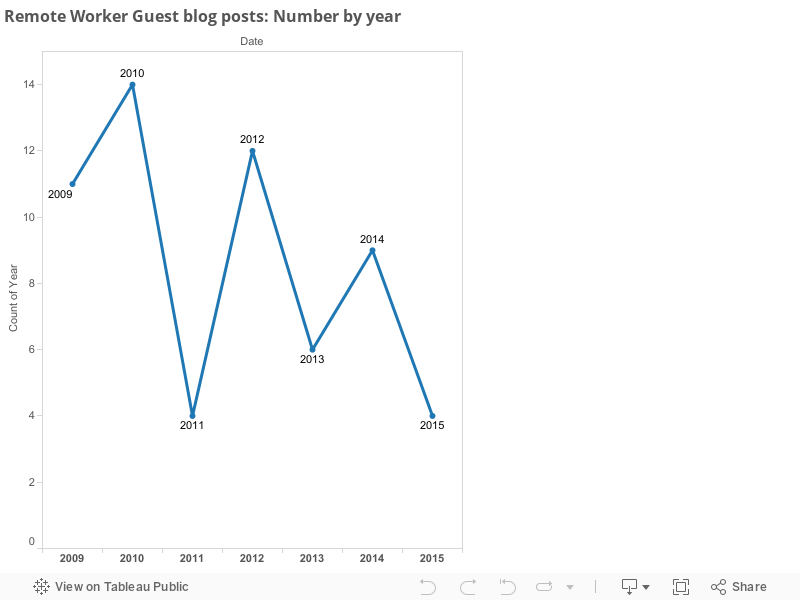
I then looked at how many guest blog posts are submitted by year. It looks like the number is on the decrease, see this visualisation.

Remote Worker Guest blog posts: Number by year

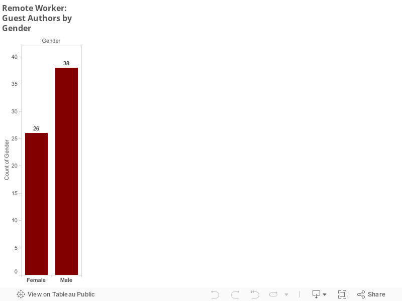
I finished by looking at the gender of my guest authors. The main trend there seems to be less male authors over time – not sure what I’m doing to drive them away! 😉 See this visualisation for details by year and this visualisation for totals (26 Females, 36 Males – 64 in total).

Remote Worker: Guest Authors by Gender and Year
Remote Worker: Guest Authors by Gender

I’ll continue to work on Tableau public for the project – hopefully my data visualisations will improve over time!